What makes hoodie embroidery look premium instead of cheap, lumpy, or badly placed? The answer is not a huge logo or the most expensive thread. Good embroidery starts with the hoodie fabric, then matches stitch density, design scale, thread weight, and placement to that fabric. Get one of those wrong and even a clean logo can pucker after the first wash.
The best hoodie embroidery is simple, properly sized, and built for the garment underneath. A dense design needs firm fleece. A thin hoodie needs fewer stitches. A detailed illustration may need a patch or print instead. That is the straight answer.
What Makes Hoodie Embroidery Look Good?
Embroidery works by pushing thread through the fabric thousands of times. That creates texture, but it also adds tension. A hoodie is softer and stretchier than a woven shirt, so the fabric can pull away from the design while the needle moves. The basic goal is to create enough structure for the thread without making the garment stiff.
Choose stitch density before choosing decoration
Small lettering needs a clear thread path. Letters below 6 millimeters high often close up, especially in bold fonts. For readable text, use uppercase characters at least 8 to 10 millimeters high, with moderate spacing between letters. Avoid thin script fonts unless the words are large enough to keep their shape.
Large solid areas create a different problem. A 10,000-stitch chest graphic can flatten soft fleece and produce a raised, board-like patch. The best designs use a mix of satin stitches, running stitches, and open sections. Let the hoodie show through when the shape does not need full coverage.
Match thread texture to the message
Rayon thread gives a bright, smooth finish that works well for polished lettering and small logos. Polyester thread has a slightly flatter shine and handles repeated washing better. Matte thread looks more casual and suits workwear or vintage graphics. Do not mix shiny and matte thread without a reason. The contrast can make the design look accidental.
The clearest verdict: a one-color or two-color design with strong outlines usually looks better on a hoodie than a detailed image with six thread colors. Embroidery is strongest when it adds texture and shape, not when it tries to copy a photograph.
Which Hoodie Fabric Holds Embroidery Best?
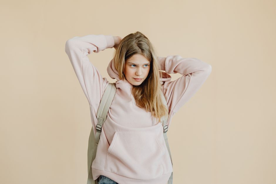
Fabric weight decides how much embroidery a hoodie can carry. Heavy fleece supports dense stitching because the surface does not shift as much. Lightweight French terry needs a smaller design and a lighter stitch count. The wrong match creates ripples around the design, loose thread, or a stiff square that ruins the drape.
Use this fabric guide before approving a design
| Hoodie fabric | Typical weight | Best embroidery size | Best design choice | Verdict |
|---|---|---|---|---|
| Lightweight French terry | 6 to 8 oz | 2 to 4 inches wide | Small chest mark or sleeve text | Best for minimal designs |
| Midweight cotton blend fleece | 8 to 10 oz | 3 to 7 inches wide | Chest logo or compact graphic | Best all-purpose option |
| Heavy cotton fleece | 10 to 14 oz | 5 to 10 inches wide | Large back graphic or varsity lettering | Best for dense embroidery |
| Brushed polyester fleece | 8 to 12 oz | 2 to 6 inches wide | Low-density logo | Use a stable backing |
| Stretch performance fabric | 5 to 8 oz | Up to 4 inches wide | Short text or simple icon | Avoid heavy stitch counts |
For most people, a midweight cotton blend is the safest choice. It has enough body for clean stitching without feeling as bulky as heavyweight fleece. Cotton-rich fabric gives a softer, more natural surface, while polyester content reduces shrinkage and helps the hoodie keep its shape.
Pre-shrink cotton garments before production whenever possible. If the hoodie shrinks after embroidery, the thread stays closer to its original size while the fabric contracts around it. That is how puckering starts. A stable cutaway backing on the inside also spreads tension across a wider area.
Best fabric verdict: choose 8 to 10 ounce fleece for a regular chest design, and reserve 10 ounce or heavier fabric for large, dense embroidery. Thin hoodies are not automatically bad, but they punish oversized designs.
Why Smaller Hoodie Embroidery Usually Wins
Keep the main design between 3 and 7 inches wide. That range gives a chest logo enough presence without turning the front of the hoodie into a stiff sign, and it leaves room for the garment’s seams, pocket, and natural folds.
Put left-chest embroidery about 7 to 9 inches below the shoulder seam and 3 to 4 inches from the center line; place a centered design 3 to 4 inches below the collar for a compact mark, or 6 to 9 inches below it for a larger streetwear graphic.
Use the back only when the artwork still reads from several feet away. A back design should have a strong outer shape, limited text, and enough empty space around the hood and shoulder seams. If the design needs a paragraph to explain it, embroidery is the wrong format.
For the best hoodie embroidery, choose one visual idea: a small emblem, a short phrase, a number, or a bold symbol. Two colors are enough for most wardrobes. Three can work for varsity lettering, but extra colors add cost and visual noise without adding much style.
Which Hoodie Blanks Are Best for Embroidery?
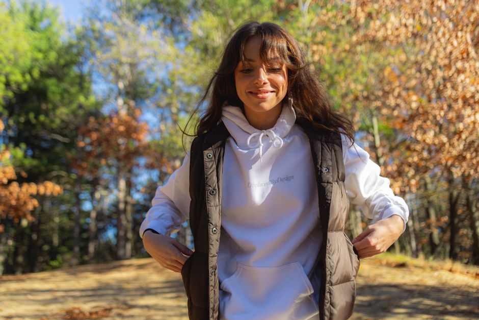
The hoodie blank matters as much as the artwork. A cheap blank may have uneven fleece, a loose knit, or a hood that pulls the neckline out of shape. A very heavy blank can support more stitches, but it may also make a small design feel overdressed. These are the practical options worth comparing.
| Hoodie blank | Fabric and weight | Approx. retail price | Best embroidery use | Verdict |
|---|---|---|---|---|
| Gildan Heavy Blend 18500 | 8 oz, 50/50 cotton-polyester | About $25 | Small logo, school lettering, basic custom wear | Best budget blank |
| Independent Trading Co. SS4500 | 8.5 oz, cotton-polyester blend | About $35 | Clean chest logos and streetwear graphics | Best balance of price and finish |
| Carhartt K288 Midweight Hoodie | 10.5 oz, cotton-polyester blend | About $60 | Workwear marks and rugged sleeve embroidery | Best for durability |
| Champion Reverse Weave 996M | About 12 oz, heavyweight cotton blend | About $70 | Dense varsity lettering and large back designs | Best premium embroidery base |
| Patagonia Fitz Roy Icon Uprisal Hoodie | Recycled blend, roughly 10 oz | About $89 | Small sustainability or outdoor-themed marks | Best for a softer premium message |
The Champion Reverse Weave 996M is the clear winner for dense embroidery. Its heavyweight construction gives the needle a stable surface, and the reverse-weave structure reduces the sloppy drape that can make a big design sag. Choose the Independent Trading Co. SS4500 for a normal chest logo because it feels modern without demanding a premium price.
The Gildan Heavy Blend 18500 is fine for testing a design or ordering a large batch on a budget. Keep the artwork simple. Its softer, lighter fabric does not reward a packed stitch file. The Carhartt K288 makes more sense for outerwear-inspired styling, but its heavier fabric and workwear shape can look too bulky with delicate lettering.
Skip the premium blank if the design itself is weak. A $70 hoodie cannot rescue poor spacing, a crowded logo, or thread colors that disappear into the fabric. The best purchase for most fashion readers is the SS4500 with a 3-to-5-inch, two-color chest design.
What Ruins Hoodie Embroidery?
Most bad embroidery comes from predictable mistakes. Fix these before production and the final garment will look cleaner, wash better, and feel like clothing instead of promotional merchandise.
- Using a logo that is too detailed. Tiny facial features, narrow lines, and small words collapse when stitched. Simplify the artwork before sending it to the embroiderer. Keep the outer shape and remove details that will not survive at the final size.
- Ignoring the pocket. A kangaroo pocket changes the front tension and can block the machine hoop. Do not place a large design over the pocket seam. Use a left-chest mark above it or move the main graphic to the back.
- Choosing thread with weak contrast. Tonal embroidery can be stylish, but the thread must still separate from the fabric under indoor light. Test black on charcoal, cream on oatmeal, and dark green on brown before approving the full run.
- Skipping backing. Stretchy fleece needs support. Tear-away backing works for stable, light designs, while cutaway backing gives better long-term support on soft or stretchy hoodies. Ask what backing will be used instead of assuming the thread alone will hold the shape.
- Washing the hoodie like a towel. Turn it inside out, use cold water, choose a mild detergent, and air-dry or tumble-dry on low. High heat can shrink the fabric around the embroidery and create puckering. Never iron directly over raised thread.
- Approving a sample without wearing it. A design can look centered on a flat table but sit too high once the hood and shoulders pull the garment. Try on a sample, zip or tie the hood, and check the design while standing and sitting.
Best mistake-prevention rule: approve one physical sample before ordering multiple hoodies. A digital mockup cannot show thread shine, fabric stretch, pocket interference, or the real scale on a human body.
Hoodie Embroidery Questions Buyers Still Ask
Is embroidery better than printing on a hoodie?
Embroidery is better for short text, compact logos, and designs that need texture. It feels more substantial and can survive years of washing when the stitch file and backing are correct. Printing is better for gradients, photographs, oversized illustrations, and very soft lightweight hoodies. If the design has broad color blends or more than four tiny visual elements, choose a print instead. My verdict is simple: use embroidery for symbols and lettering, not for artwork that depends on smooth shading.
What is the best embroidery placement on a hoodie?
Left chest is the safest placement for everyday wear because it stays visible under an open jacket and does not compete with the pocket. Center chest works for a stronger streetwear statement, but keep the design at least 3 inches below the collar. Sleeves suit short words, numbers, or a narrow emblem. The back gives the most space, yet it needs a bold design that can be read from a distance. For one versatile hoodie, choose a 3-to-5-inch left-chest design.
When should I avoid embroidered hoodie designs?
Avoid embroidery when the hoodie is very thin, highly stretchy, heavily ribbed, or covered in a loose pile. Also avoid it when the design contains tiny text, photographic detail, or a large solid area that would require excessive stitching. A woven patch, screen print, or direct-to-film print will give a cleaner result in those cases. The right alternative is the one that protects the garment’s drape instead of forcing every idea into thread.
So, what makes the best hoodie embroidery? Start with a stable 8-to-10-ounce blank, keep the design compact, use strong contrast, and approve a physical sample. If you wanted a hoodie that looks polished in the opening scenario rather than lumpy after one wash, that combination solves the real problem.